Introduction

If you've just stumbled onto this blog, please forgive the appearance; it's still under construction. If I've used one of your photos (found on Google) in a lecture and you don't approve, please write a comment and I'll remove it.

The purpose of this blog is to explain the basics of art and culture to English language learners in secondary school in Slovakia. This is not for profit. If you look to your right, you'll see a long list of topics that I plan to cover. This is a large project that will most likely take years to complete, covering some topics I know little about (like dance), so I will be borrowing heavily from other experts, with their permission, giving credit wherever possible. Please be patient, and, of course, all advice is greatly appreciated.

Monday, February 9, 2015

Biography of Alfons Mucha


Alfons Maria Mucha (1860-1939)

v     Alfons Mucha was a world renowned artist and designer from the Czech Republic.

v     Mucha is one of the founders of the Art Nouveau movement, which was originally called the Mucha Style.

v     Mucha studied at some of the most prestigious art academies in Europe, studying under Lefebvre, Boulanger, Laurens, and sculptor Filippo Colarossi.

v     In 1900, Mucha decorated the Bosnia and Herzegovina Pavilion at the Universal Exhibition in Paris, a celebration of modernity in art and design.

v     Mucha also decorated the Theatre of Fine Arts in Prague, and the Mayor's Office there.

v     When Czechoslovakia won independence after WWI, Mucha designed all the stamps, banknotes, and government documents for the new state.


v     In 1928, Mucha gave Prague his life's work, the Slav Epic - a series of 20 giant paintings, telling the history of the Czech and Slavic people. It's currently on display in the National Gallery's Veletržní Palace.

Personal Life:

Alfons Mucha was born in Ivančice, Moravia. Although poor, he was a talented singer, earning a scholarship to attend Gymnázium Slovanské in Brno. His choirmaster was Leoš Janáček, now a famous composer. Upon graduation, Mucha began work painting theatre props and scenery.

His first big break ended in ruin, when he moved to Vienna to work for the Ring Theatre. The theatre burned down, and he lost his job. But, Mucha was determined, and soon got a commission to paint murals for the wealthy Count Karl Khuen's castle Hrušovany Emmahof. The Count was so impressed he paid for Mucha to attend the Munich Academy of Fine Arts, and then the Academies Julian and Colarossi in Paris.

In Paris, Mucha had a hard time when the Count's money ran out, but he found his second lucky break. While in a print shop, he heard the need for a theatre poster in two weeks for Sarah Bernhardt - the most famous actress in Paris. Alfons offered to do it, and Sarah was so happy with his poster she signed a six-year contract with him.

Sarah Bernhardt's first poster, in 1894

Mucha began his professional career as a designer, planning things like jewellery, carpets, silverware, theatre sets, shop interiors, windows, posters, and other advertisements, all while drawing and painting.

In 1906, Mucha married Maruška Chytilová, and the two went to America, travelling there for the next four years. Their first child, Jaroslava, was born in New York City. Mucha spent time in America looking for a patron, so he could stop doing commercial art. Millionaire Charles R Crane agreed to help him, as a way to promote revolution in Moravia. Then, they moved to Prague and had their second son, Jiři, who became a writer and journalist.

Mucha died tragically. When the Germans came to Prague, he was one of the first questioned by the Gestapo. While in custody, he developed pneumonia and died soon after his release, and was buried in Vyšehrad cemetery. During socialism, Mucha's work was considered old fashioned and locked away for over 25 years. Since the release of its work, his style has been copied countless times by other artists.

Art Nouveau:

Art Nouveau is a style of art, mostly decorative, that arose around the beginning of the 20th century. Art Nouveau actually goes by several names. In Germany it's Jugensdstil, in Austria it's Secession, in Italy it's Stile Liberty, and in Spain, it's just Modernisme. It can best be described as a more organic approach to the designs of the Baroque and Rococo. It makes use of columns and arches, and other decorations, but they all branch out like trees, vines, and flowers. The idea was to try to harmonize the artificial world with nature. Art Nouveau artists believed in the importance of beauty as part of your everyday life, designing everything to be lovely - from lamps to dishes, carpets, everything. You can usually tell when something is Art Nouveau by the use of sharp "whiplash" curves, and parabolas. Everything appears to be growing like a plant.

The Slav Epic:

This is a cycle of twenty large paintings showing the history and mythology of Czechs and other Slavic peoples. Mucha traveled to Russia, Poland, and the Balkans gathering ideas and speaking with historians. It took Mucha eighteen years to complete the cycle, after which he gave it to the city of Prague, on the condition that they build a pavilion suitable to showcase it (why wouldn't they, right?).  The town agreed, and everything was fine until WWII, when the Slav Epic was hidden away from the Nazis. At the close of the war, communism had come to Czechoslovakia, and Mucha's work became politically incorrect - it was a product of the rich bourgeoisee. So, the cycle was moved by a few supporters to a castle in the town of Moravský Krumlov. The Slav Epic remained locked there for fifteen years before they finally opened it up to the public. Today, Prague very much wants these paintings back, and is fighting a hard legal battle to do so. It turns out Moravský Krumlov is very proud of its Slav Epic, and Mucha's grandson, Jan, agrees, and is very angry at the idea of Prague taking them back, when there's still no suitable Pavilion to show the work. Jan and others of Moravský Krumlov feel the National Galleries in Prague aren't nearly as nice a place to show the work.

The twenty paintings are titled:


1. Slavs in their Original Homeland: Between the Turanian Whips and the sword of the Goths.


2. The Celebration of Svantovit: When Gods Are at War, Salvation is in the Arts


3. Introduction of the Slavonic Liturgy: Praise the Lord in Your Native Tongue.


4. The Bulgarian Tsar Simeon: The Morning Star of Slavonic Literature.


5. The Bohemian King Přemysl Otakar II: The Union of Slavic Dynasties.


6. Coronation of Serbian Tsar Stefan Dušan as East Roman Emperor: The Slovak Code of Law


7. Jan Milič of Kroměříž: A Brothel Converted to a Convent.


8. Master Jan Hus Preaching at the Bethlehem Chapel: Truth Prevails.


9. The Meeting at Křížky: Sub Utraque.


10. After the Battle of Grunwald: The Solidarity of the Northern Slavs.


11. After the Battle of Vítkov Hill: God Represents Truth, Not Power.


12. Petr Chelčicky at Vodňany: Do Not Repay Evil with Evil.


13. The Hussite King Jiří of Poděbrady: Treaties Are to be Observed


14. Defense of Sziget against the Turks by Nicholas Zrinsky: The Shield of Christendom.


15. The Printing of hte Bible of Kralice in Ivančice: God Gave Us a Gift of Language.


16. The Last Days of Jan Amos Komenský in Naarden: A Flicker of Hope.


17. Holy Mount Athos: Sheltering the Oldest Orthodox Literary Treasures.


18. The Oath of Omladina Under the Slavic Linden Tree: The Slavic Revival.


19. The Abolition of Serfdom in Russia: Work in Freedom is the Foundation of a State.


20. Apotheosis of the Slavs: Slavs for Humanity.

Monday, February 2, 2015

Introduction to Graphic Design

Graphic design is the art of communicating visually for business purposes. It's used in advertising, education, and politics. Graphic designers create signs, posters, billboards, logos, symbols/icons, patterns, t-shirt decals, home decorations, cards, brochures, newsletters, book & magazine pages and covers, newspapers, and internet web pages.

Eric Fleishman once said, "Art is the most elegant way of getting from point A to point B." If that's true for art, then graphic design must be the clearest and most memorable route to point B. Your message must be clear, simple, easy to understand, and catchy.

Graphic design uses the same compositional elements and principles as all art. But the building blocks are a bit different, or at least designers think of them differently. The four basic components of graphic design are:
Text
Symbols
Photos
Background (negative space)

Graphic designs have much in common with cartoons and sketches, in that non-artists assume that, because they're simple, they must be easy to do. But...

simple ≠ easy.

The principle behind tightrope walking is simple. Keep your hands out, and put one foot in front of the other - but that doesn't mean it's easy. Graphic design is also a challenge, and a fun way to examine all the difficulties is to see what it looks like when someone fails. Some of these examples are crude, but I promise the goal here is learning. Remember, it's all funny until you're the one presenting one of these epic failures to your boss:

Text

First of all, learn how to spell:


Seriously, learn how to spell:

 
Emo bagels...

I mean, this is your job. You have to know how to spell:


When planning text, you have to measure it all, so it will fit. Count how many letters and empty spaces, and figure out how big they can be for the given background:

Would you go to this school?

Text placement is critical!!! Don't give the reader options for how to read the text, and remember, people in western countries read from left to right, top to bottom. Don't try to change it:


Asking people to read top to bottom before left to right will confuse and upset them:

Pop Music Album covers often get away with this

Unless of course, you break up your text into separate signs. In this case, people will see each sign as a separate page and will want to read each one entirely, before going on to the next one:


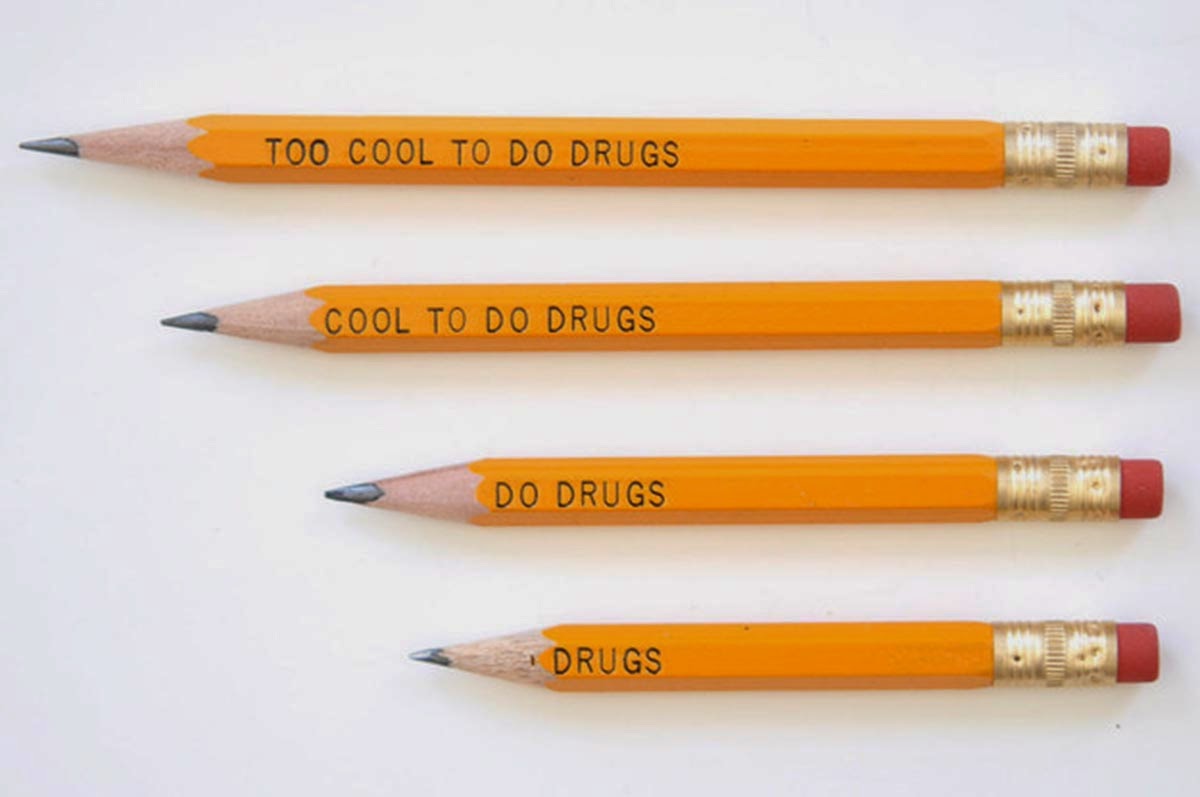
Don't crowd your letters:


Also note, it doesn't matter if you mix fonts. Any time you place letters together, people will read them as if they're supposed to go together:

10 lb. bags of mice at McDonalds. I bet every location has one.

And, yes it's a sign, but grammar still matters! One comma can make all the difference:

(tasteless means bez chuť)

Jan, Simona, no smoking alcohol!

Here's another unintended combination of words:


Note how one simple line can divide these concepts, expressing to the reader that these are in fact two different places:


Don't interrupt yourself, making people read two different texts at once:


Scrambling your words and letters doesn't make you look deep. It makes you look drunk:


Some designers combine words together in creative ways. Sometimes it works, and sometimes it doesn't:

Poo Life...

Proofread all your text before printing:


Does it make sense?


Really?


Really?

I'll do that.

sigh...
I bet this made sense to the idiot who installed it. "But it's red!"

Check for any accidental extra spaces:


Also check if spaces are needed:

I think I actually saw this one in real life... in Arkansas?

Here's one that's a constant problem for me on this blog: Keep all your text one font and one size. Otherwise it can give readers a headache. BlogSpot.com has some real issues with their software. My posts always look different when I publish them.


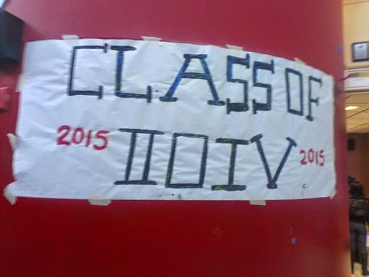
If you don't know Roman numerals, don't try to fake it:


Don't cheat on acronyms. It makes you look stupid:


When translating foreign text, find a native speaker:


When designing travel ads, learn your geography:


Many designers enjoy the challenge of creating a new font - something beautiful, energetic, etc. That's great, but ask yourself, can people still read this? If it takes longer than 10 seconds just to decipher your font, don't use it:


I said stop it!


Just because it's a traditional font, doesn't mean it can't be misread:


Here's a shirt with two confusing letters in one word. Note how the bottom line of the 'L' matches the line on the right, which means nothing, reinforcing the idea that it's really a 'P':


Why is there an 'x' in this product?


You might think that flipping a letter around makes it look better. It doesn't!

Which do you think tastes better? Red Rocket or Red Rooket?
The correct answer is neither.

And if you have the bad sense to write the entire word backwards, at least take a moment to see how it would sound once spelled in reverse:

Your product was Zune, what's wrong with you?

Here's another playful font gone terribly wrong:

It's not just the confusion, but the context that makes this fail epic.

Also note, so far as choosing fonts, that 'A' and 'R' look fairly similar:

I hope someone got fired for this.

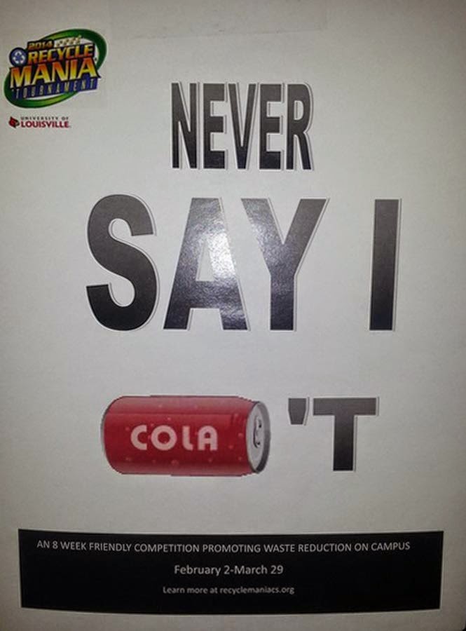
Yes, I know it's a can. But you wrote 'cola' on it, and people see text before they see shapes:


Beware of confusing text!!! Remember, many words have more than one meaning:


Also, beware electronic signs and software. They don't always work:


Also, take a moment to consider whether your text/logo might be offensive, for any reason:

(familiarize yourself with common abbreviations)

Or is your idea really appropriate? Is this the best way to spread your message?


And, before you sell your product, take a moment to think how it might change over time:


Here's a nice neighbourhood:


Symbols & Logos

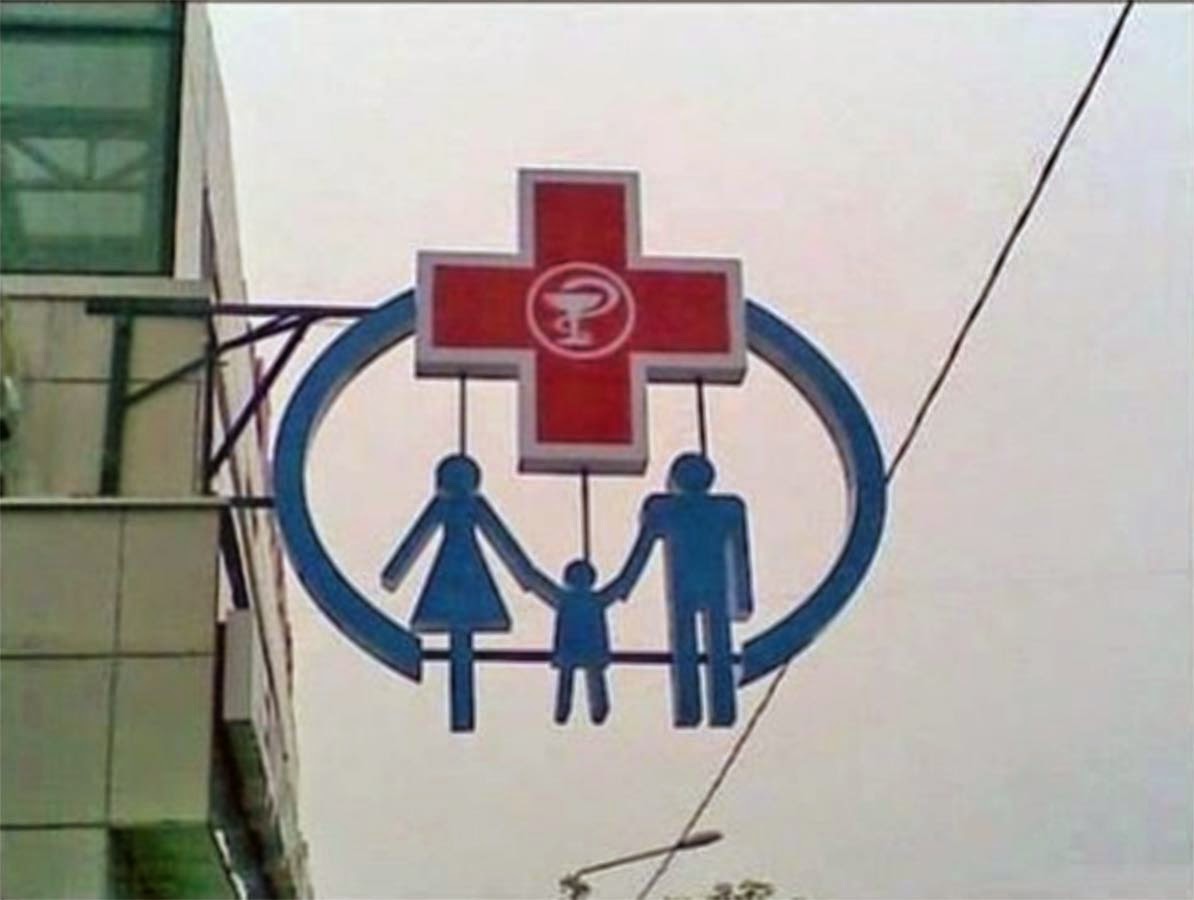
Symbols can often be misread. Every little line counts and has meaning, even when unintended:

Welcome to Obamacare :D

And, just because you're simplifying reality, doesn't mean you can take out important elements and people will just add them in. Not everyone will see a chair that isn't there:


And, just because the anatomy has been simplified, doesn't mean you don't have to worry just as much about gesture and body language as every other artist:

What, you thought you could just skip figure drawing classes?

The same goes for animal anatomy:

Is it a bird or a fly?

Also, don't take existing symbols and try to change the meaning. People will see this and wonder how it's possible that fetuses could ever send, receive, or need Wi-Fi:

"Your baby doesn't get wi-fi? How's he gonna check his app's?"

When you make stick people, it can be hard to tell if they're facing toward you or away from you:

(Hey! I didn't make it! Someone else did this!)

A face would help:


Beware pareidolia! It's when people see patterns and images that weren't intended, like bunnies in clouds, faces in chipped paint - or women's breasts:


Pareidolia is powerful. Any circle on a stick will look like a person:


As will certain letter combinations. Remember, not everyone knows about the Office of Governemntal Commerce. But, everyone will see a snowman (emphasize 'man') if you make the mistake of putting this on your brochures:


Not everyone sees positive and negative space the same way, so not everyone will see the Japanese building:


The problem above is that it goes against what we know about light and shadow. Any time you put something in front of a bright light, like the sun, you'll only see a black silhouette. Ignore the rules of light and shadow at your own peril. At least it was easy to fix:


And, promise me you'll never use a cat's behind as a graphic element:

Nothing says haute couture like a cat's anus.

Pattern

Once a pattern is established, stick to it. If you make one tiny little mistake people will see it.


Graphics

When designing a graphic, check to see how it looks on the desired surface before you send it off for printing. You might be surprised:

(They put a light there?)

"This is going on a T-shirt, right?"

Graphs & Charts

A graph is supposed to present mathematical data, clearly and accurately. If you don't know math, don't make graphs:


Photos

Before you begin manipulating figures in Photoshop, learn the basics of anatomy.


Also learn the basics of human expression, or your airbrushing will make people look scary

Is this smile really charming?

And, you can't just cut up a picture, move the pieces around, and expect the proportions to stay the same:

Still, strangely appropriate

Nor should you change the proportions of a photo directly - at least not with people:


Watermarks

Here's an issue that designers and photographers share - adding watermarks to your work to prevent copyright abuses. A watermark is (hopefully) a little bit of text or symbol with your name, logo, or website, showing that you own the image. No one else can use it without your permission. It's supposed to be so small you don't notice it. But, some people are so afraid of theft, they paste watermarks all over their work, ruining it:


Here are some things to keep in mind:

1. Whatever you made, there are probably thousands of pictures just like it (and someone probably does it better). The chance of someone stealing your work, or even finding it, is slim. I think it's happened to me once in 14 years.

2. Whether you're a designer or photographer, you need to do a great deal of self-promotion, meaning showcasing your work all over the net. It has to look good and presentable. The work you upload is a bit of a throw-away. You have to expect that someone is going to take it and use it, but that's okay, because it's a throw-away. If all you have is that one good photo, and you're afraid to lose it, then you're not a professional because...

3. You're not really selling your work, you're selling yourself - your expertise, your ability to make new good work, consistently, and on time.

Product Placement

You might not have as much control over this as you'd like, but if you do get the responsibility, check whether you're really putting the right sign in the right place:

 
This is so wrong.